Refresh My Brand logo

Refresh My Brand helps growing businesses fix what their brand says, how it looks and how customers experience it, so the right people understand them, trust them and choose them. Founder Dan DeMarco has been designing brands since 2000. With Refresh My Brand he set out to bring that experience to the businesses that need it most: the ones that have outgrown the brand that got them here.

As a brand-new company, Refresh My Brand needed a website that could do the hard part: get in front of the right people, show them what brand clarity looks like, and turn that recognition into a conversation.

A Brand Expert

Without

a Home Online

Dan knew his craft. What he didn’t have was a picture of what his own website should be. He had a name, a lime and charcoal palette, a set of services and a clear sense of who he wanted to help, but no idea how to turn all of that into something a prospective client could see, feel and act on.

That is a harder problem than it sounds. A brand consultant’s website is its own first case study. If it looks generic, the message is lost before the first sentence. And brand clarity is an idea, not a product. There is nothing to photograph, so most sites in this space fall back on stock photos of handshakes and whiteboards: the very sameness Refresh My Brand exists to fix.

Refresh My Brand home page on a phone
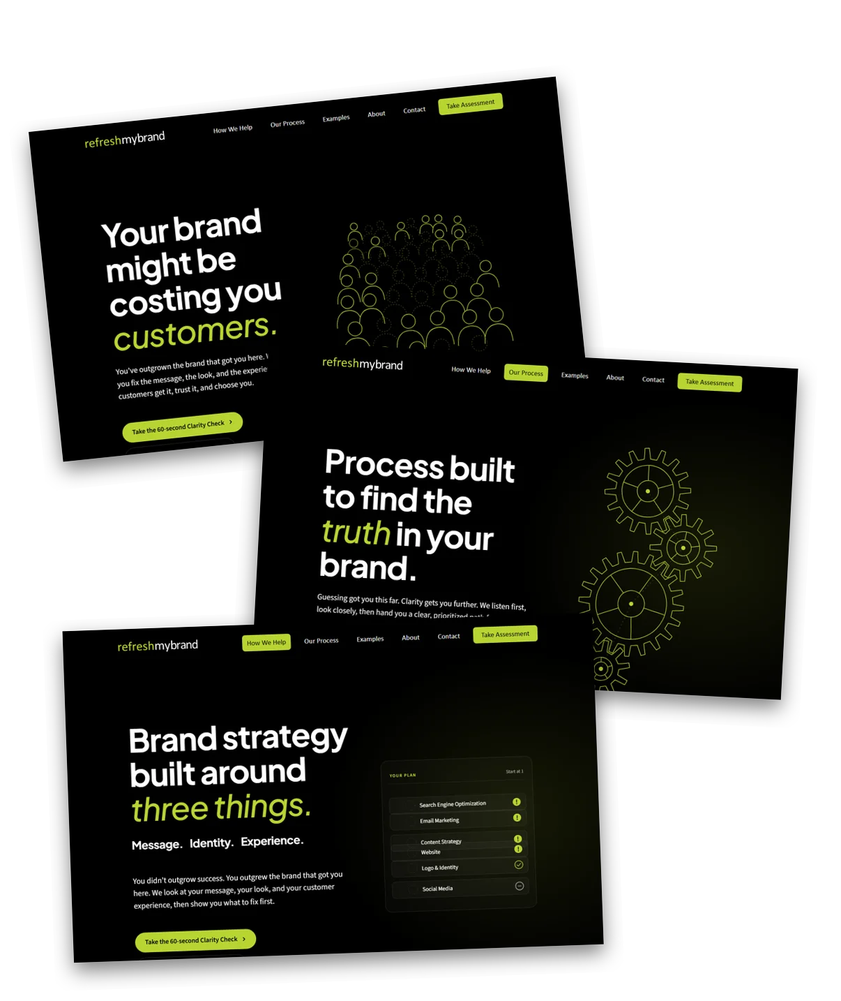
complete home page directions to start
0
rounds of site-wide design refinements
0
client case studies live at launch
0
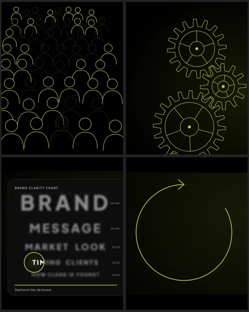
Custom animated illustrations from the Refresh My Brand website

Show It,

Don’t

Just Say It

We started by listening. Who does Dan want to reach, what keeps them up at night, and what should they feel in the first few seconds? The answer was clear: established businesses whose brand hasn’t kept up with their growth. They are busy, skeptical of agencies and allergic to jargon. They need to recognize themselves on the page, quickly, before they will trust anyone to help.

So instead of describing brand problems, the site would show them. Instead of stock photography, every visual would be drawn in the brand’s own lime, charcoal and white, so the whole site reads as one system: a working example of the consistency Refresh My Brand sells.

Iterating

Side by Side

We built this site with Dan, not just for him. It started with three complete home page directions, each a working page rather than a static mockup, so Dan could click through and react to the real thing. From there we worked back and forth in short loops: a change in the morning, Dan’s reactions by afternoon, a new version that evening.

Nothing was precious. Ideas were built, tried in the browser, and kept or let go. Over about three weeks the site went through dozens of versions, and every round brought it closer to what Dan had in his head but couldn’t yet describe. Watching it take shape was how he found the words for it.

Art Made

for the Brand

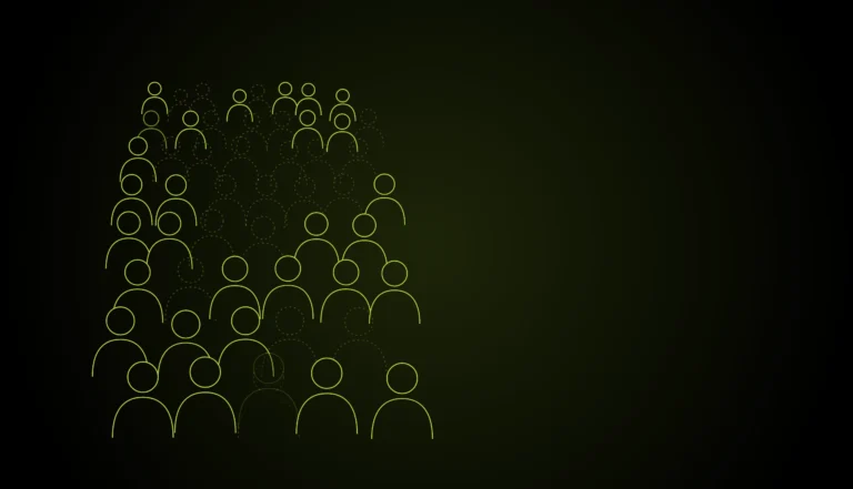
Every page opens with its own animated illustration, built in code in the brand’s colors. On the home page, a crowd of potential customers thins out one by one: the cost of an unclear brand. Our Process turns on a set of interlocking gears. About resolves a tangle into a clean refresh arrow. Contact plays out a short conversation with Dan.

Each client case study opens by drawing that client’s logo line by line, then filling it with color, and many show the old logo becoming the new one. Even the client logo strip on the home page drifts, pauses and lights up under your cursor. It all feels like Refresh My Brand, because it was made for Refresh My Brand.

The Refresh My Brand Clarity Check assessment

A Mirror

For Every

Visitor

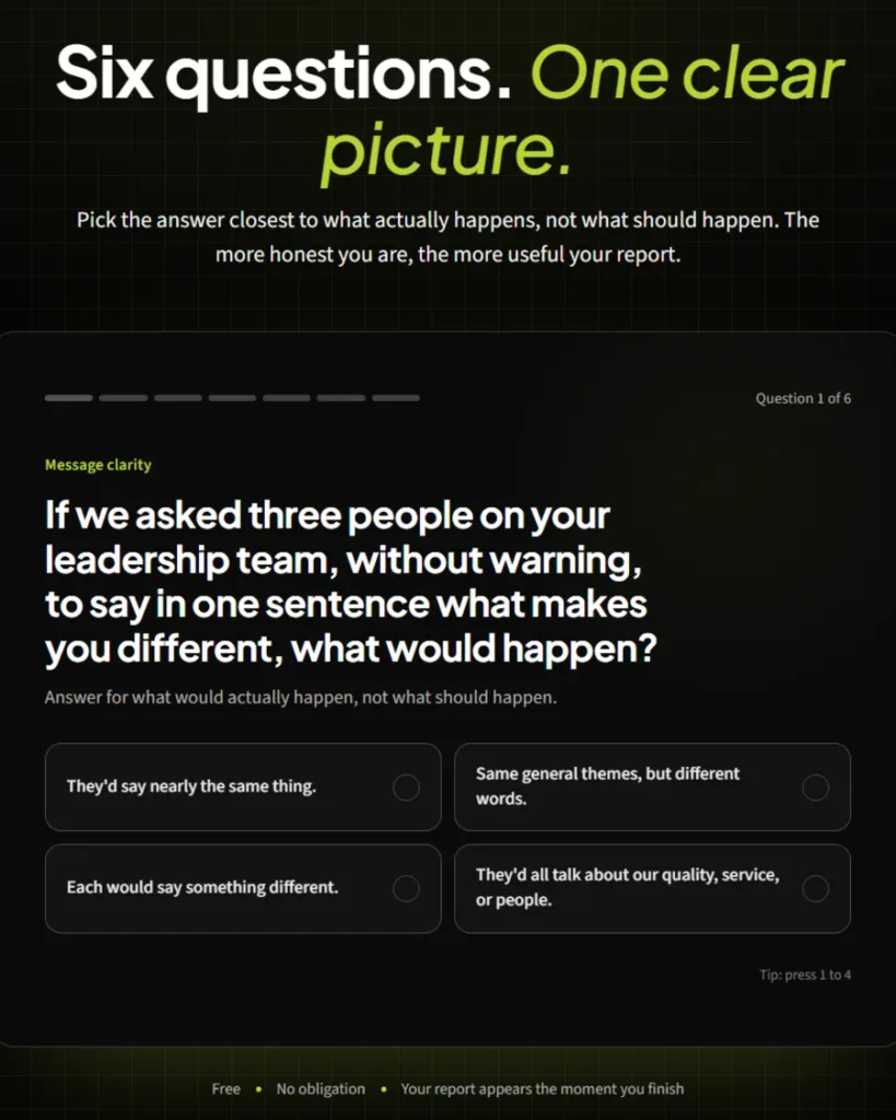
The centerpiece of the site is the Clarity Check, an interactive assessment that helps a business owner see their own brand the way a customer does. Six questions, one at a time, cover message clarity, market perception, visual consistency, customer experience, timing and readiness. Every answer is written to be honest, not flattering.

At the end, the visitor gets a personal report on where their brand is strong, what to watch and where the real gaps are, with a plain explanation of why each one matters. Dan gets the same answers in his inbox, so his first conversation with a new prospect starts with real insight instead of small talk.

From Promise

to Proof

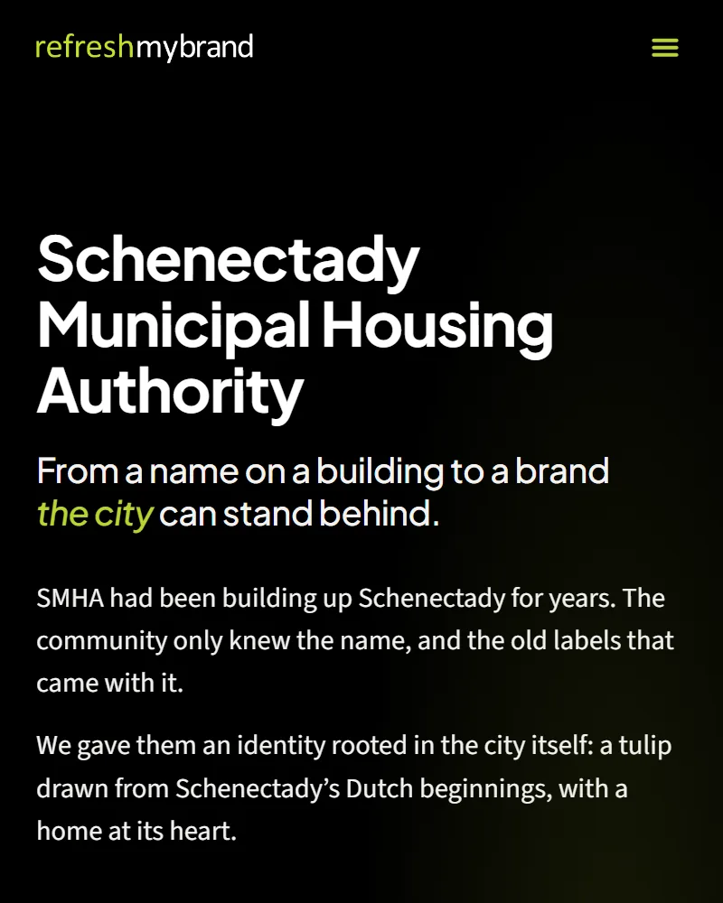
A new company has to show its work. Every page leads to one of two clear next steps: take the Clarity Check, or book a free Brand Clarity Review with Dan. Between them sit real client case studies, from a housing authority and an IT company to a brewery, a cigar shop and a newly merged consulting firm. Each one shows the brand before and after, why the changes were made, and what they meant for that business.

Bringing a Brand’s

Vision to Life

A Refresh My Brand client case study on a phone

Way Beyond

What I Imagined

“I came in without a clear idea of what my website should be. Working with Rampant Imaginations was easy, and honestly exciting. Every round, I could watch the site get closer and closer to what I had in my head. The final site is way beyond what I expected, and we’re already attracting new clients. We couldn’t be more excited to be live.”

Dan DeMarco
Founder, Refresh My Brand

Want to

See More?

Stay Ahead of

The Pack

Your competitors are constantly working on their game. If you aren’t planning for your next phase, you’ve already lost.  Get tips to help stay top of mind with your audiences, news on trends and best practices, and insights into our current projects.